
How to Build Brand Trust? These 16 Companies Put 'Trust' in Their Brands
Every business wants to be trusted—but some are better at gaining trust than others.
It helps, of...


Have you ever noticed how many brands use the color blue in their logos and on their websites?
The reason is simple: they want you to trust them.
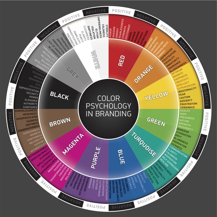
Blue is the single most frequently used color in corporate logos. It's especially common in brands where trust is paramount, such as financial services, cybersecurity, and healthcare.
Why the connection between blue and trust? Why is the color such a powerful symbol of trust?
The most common theory is that we typically have positive associations with blue -- and from the sky to the sea, these associations evoke feelings of security and permanence. Research has consistently shown blue to be the favorite color of both men and women worldwide.
Etymologically, the term "true blue" has been used to describe trustworthiness for centuries. In the Late Medieval Period, the town of Coventry, England was known for its talented dyers. Dying clothing and fabrics in those days -- using sometimes poisonous berries and plants to create pigment -- was a job that was both tedious and dangerous. The dyers of Coventry were renowned for producing blue cloth that could be trusted to never fade.
The phrase "as true as Coventry blue" was shortened to "true blue" and the rest is history.
Don't Be Blue: It's OK to Be a Different Color, Too
With trust being so important to buyers, and buyers associating trust with the color blue, does that mean it's always wise to include blue in your brand's logo?
Definitely not.
First and foremost, your company's branding should help set you apart from the competition. If every competitor in your space has a blue logo, having blue as the dominant color in your logo will make it that much harder for you to stand out.
At my agency, Idea Grove, we work with many midsize B2B tech clients in highly competitive markets, where our clients must fight tooth and nail for their share of attention -- and customers -- while facing much larger players.
We recently completed a visual branding project where the logo we created has purple and black as its dominant colors. The purple communicates imagination and luxury, while the black grounds the logo in authority. This combination was perfect for a brand that wanted to communicate creativity while being taken seriously by its Fortune 500 clients.
The client's logo inspires trust by reinforcing the qualities that set it apart. It's a subconscious trust signal that the company backs up its words with its actions.
The Color Psychology Wheel

Every business wants to be trusted—but some are better at gaining trust than others.
It helps, of...
"If everyone is special, then no one is. If everyone gets a trophy, trophies become meaningless."
...
Leave a Comment